As the sole designer, I led the end-to-end UX for the entire mortgage product line,
covering both borrower and lender platforms during an acquisition transition.
Redesigned workflows to streamline processes, reduce loan origination time,
and improve transparency and responsiveness.
Team
3 Product Managers
15 Engineers
Role
Lead Product Designer (Roostify)
Senior UX Designer (CoreLogic)
Timeline
2023-2025
87%
loan submission rate
↑15% vs. industry baseline rate
350–500+
daily active borrowers
with peaks of 950+ logins/day
$11 trillion
U.S. mortgage market
supported enterprise-scale adoption

Kumo began from a personal interest. As an immigrant navigating new environments, I’ve long been interested in mental health and personal growth — how people cope with stress, adapt to change, and build resilience. This curiosity led me and a friend to start a questionnaire exploring how others manage daily stress and emotional challenges. The responses revealed how often people keep struggles to themselves and hesitate to seek help, despite wanting safe, private outlets.

To complement this, we conducted broader research into the mental health industry, mapping existing tools and identifying gaps in real-time, personalized support. These insights became the foundation for designing Kumo: a companion that blends empathy, evidence-based guidance, and visualization to make emotional well-being more accessible.
Borrower and lender apps looked and felt like two unrelated products, creating friction.
Facilitated cross-journey mapping to identify overlaps and pain points, then established a unified design language system to ensure consistency across borrower and lender portals.
Business pushed for feature-heavy workflows like compliance and data capture while users needed simplicity & clarity.
Translated compliance requirements into progressive disclosure patterns, validated feature priorities through usability testing, and designed persona-based like first-time borrower and experienced loan officer pathways to surface complexity only when necessary.
Acquisition shifted roadmap priorities from growth startup to enterprise platform under CoreLogic.
Partnered with product leaders to re-scope MVPs in line with new business priorities and demonstrated how user research insights could translate into enterprise opportunities such as adoption, efficiency, and cost savings.
Outdated workflows and fragmented UIs—characterized by manual document handling, multiple logins, and disjointed user experiences.
Introduced automation triggers to reduce manual effort and redesigned multi-step forms into guided, save-and-resume flows.

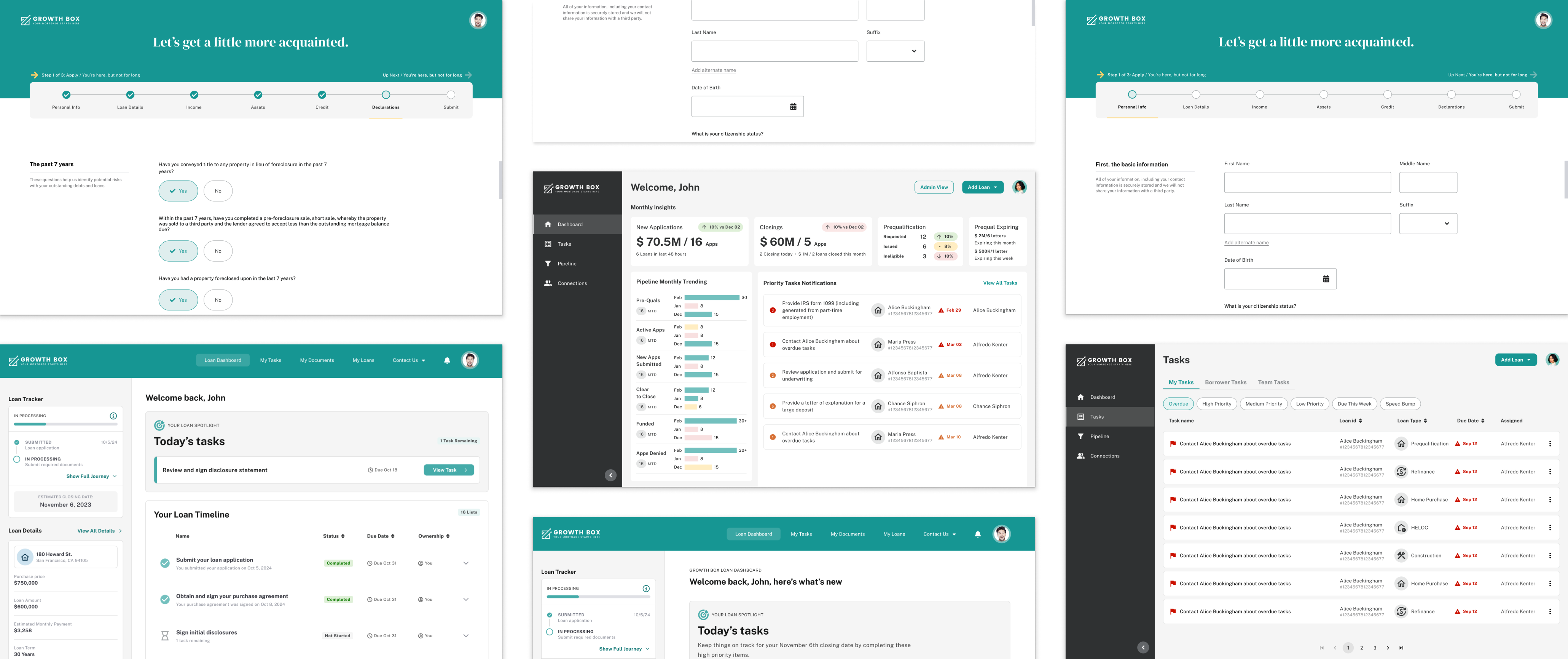
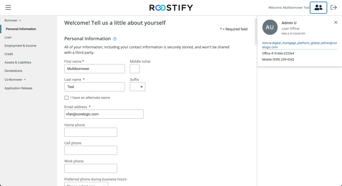
App Capture is the borrower’s entry point, where personal and financial information is
collected to begin an application. As the first touchpoint, it needed to balance strict compliance requirements
with a simple, reassuring experience that could support multiple workflows.
The previous design relied on a left-hand sidebar navigation that looked dated and felt overwhelming to borrowers. The sidebar functioned more like a dashboard menu—useful for jumping around, but ineffective for guiding borrowers through a linear, multi-step journey. On top of that, the layout did not adapt well to mobile devices, making it harder to complete applications and contributing to high drop-off rates at this early stage.
The redesign shifted from a static sidebar to a step-by-step progress tracker. After defining wireframes, A/B testing was conducted to evaluate different tracker options and validate which approach participants preferred for reducing uncertainty. Compliance requirements added another layer of complexity, as the Uniform Residential Loan Application(URLA Form) had to be translated directly into the App Capture experience. To support this, five distinct workflows were designed, Home Purchase (full application), Prequalification, Refinance, HELOC and HELOAN, and Construction, each with different forms and data requirements. The new design introduced progressive disclosure, responsive layouts, and role-appropriate guidance, helping borrowers focus on what mattered at each stage while ensuring all regulatory requirements were met.


The Borrower Portal is the borrower’s hub for tracking progress. The challenge was to
have an intuitive space that reduced anxiety and provided transparency throughout the mortgage journey.
When I joined the team, the Borrower Portal already existed, but it was visually inconsistent with App Capture including the font and the color, felt like a disconnected product, and presented features in ways that created more confusion than clarity.
The redesigned Borrower Portal helps the borrower journey feel cohesive across touchpoints. Key features were restructured for clarity and transparency: the loan tracker was redesigned to clearly show progress and closing dates, a new spotlight section highlighted the most urgent tasks, and the task list was consolidated into a streamlined checklist that guided borrowers step by step. Notifications and communication preferences were added to give borrowers more control, while a conceptual notification panel was explored to centralize updates. The design was also made fully responsive, ensuring a seamless experience across desktop and mobile. Together, these improvements reduced confusion, reinforced trust, and kept borrowers informed and engaged throughout their loan process.


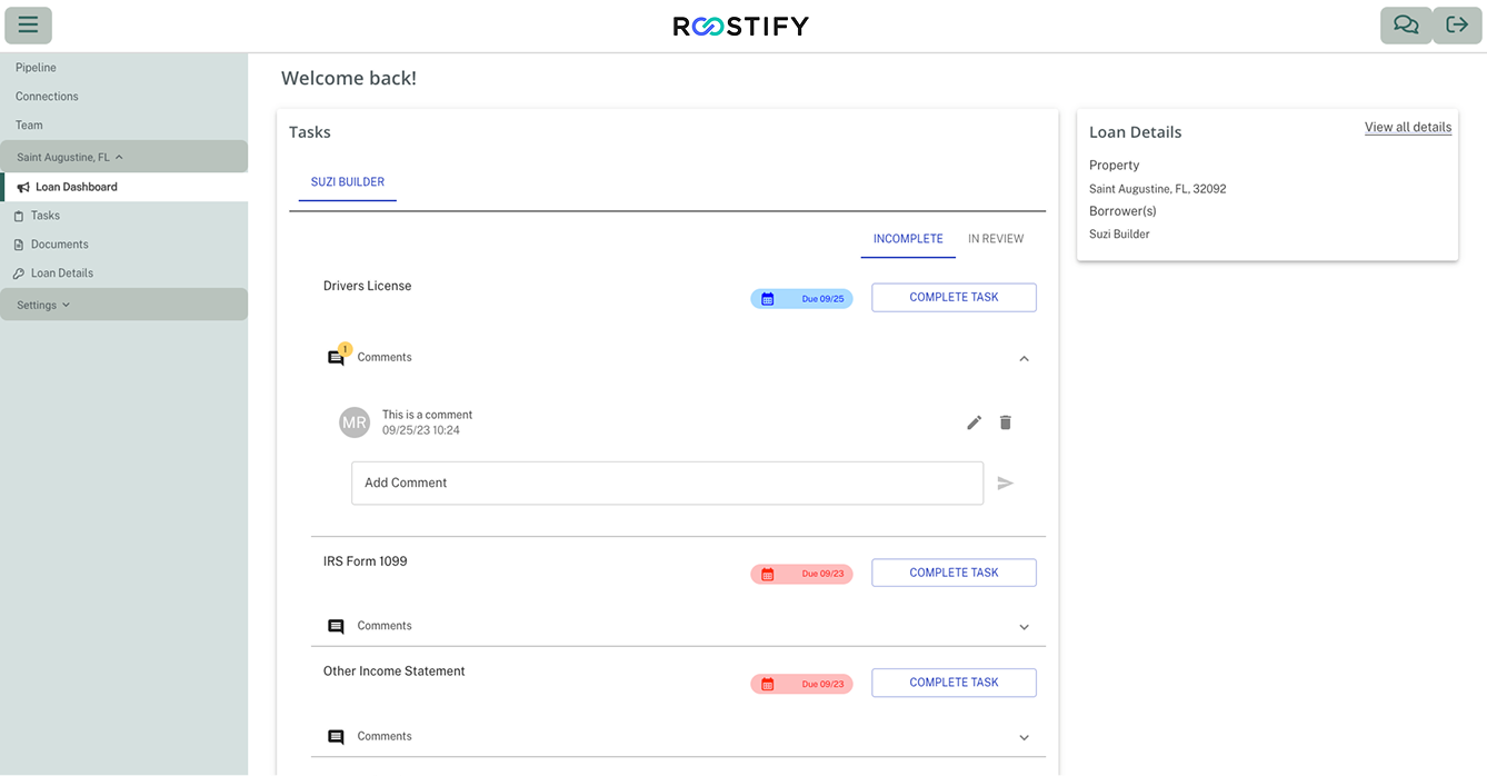
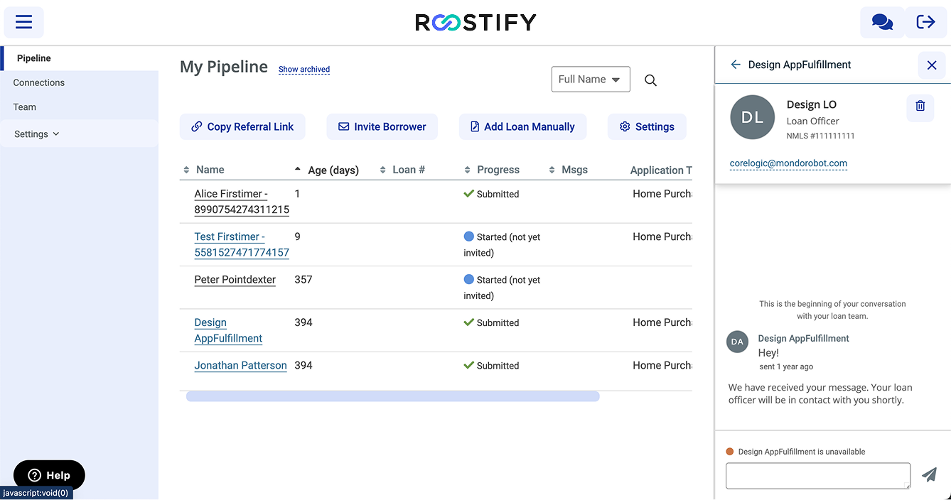
Loan Officer Portal is a streamlined workspace designed to be intuitive,
reduce clutter, prioritize key tasks, and automate processes wherever possible to improve efficiency.
The original Loan Officer Portal offered a minimalistic experience that existing users found familiar and sufficient to “get the job done,” but it lacked the structure and hierarchy needed for efficiency. Key actions were not clearly prioritized, information was presented at the same level, and the cluttered pipeline view made it hard to parse tasks quickly. Content organization added further confusion, with settings split across account-level and layout-level areas instead of following a single intuitive taxonomy. While functional, the design slowed workflows, created ambiguity, and limited scalability—particularly for less experienced loan officers and enterprise clients expecting a modern, streamlined solution.
Before the redesign, I conducted six rounds of interviews with loan officers from enterprise clients such as TD Bank and HSBC to deeply understand their workflows, pain points, and priorities. Synthesizing these insights, I collaborated closely with leadership and product management to define the MVP and align on what would deliver the most impact within the limited timeline and the context of CoreLogic’s acquisition.The redesigned Loan Officer Portal was guided by a North Star vision: create a streamlined, intuitive workspace that reduced clutter, prioritized key tasks, and automated processes wherever possible. The design aimed to meet both user and business goals — helping new loan agencies onboard quickly, reducing the cost to originate a loan (historically ~$10k), shortening the time to process and close loans, and supporting less experienced loan officers and assistants with educational, guided workflows. By rethinking task prioritization, consolidating workflows, and embedding automation, the new portal not only improved daily efficiency for loan officers but also demonstrated CoreLogic the product’s long-term value in scaling and modernizing mortgage operations.

Data Synthesis after Interviews


Led the end-to-end UX for the entire mortgage product line,
covering both borrower and lender platforms,during an acquisition transition.
Redesigned workflows to streamline processes, reduce loan origination time,
and improve transparency and responsiveness.
• Simplifying compliance-driven complexity: Translated highly regulated, multi-stakeholder mortgage workflows into user-friendly experiences people could navigate with confidence.
• Designing for interconnected systems: Unlike consumer apps, the borrower and lender sides are deeply interconnected. It taught me to consider the full system rather than isolated screens, ensuring touchpoints align seamlessly.
• Adapting design through acquisition: The acquisition forced a shift from startup speed to enterprise scale. I learned how to adapt design strategy to new priorities without losing focus on user needs.
• Communicating design in business terms: As priorities changed, I gained experience presenting design value in terms executives cared about efficiency, adoption, cost savings.
• Growing as a solo end-to-end designer: As the only designer, I had to lead research, design, prototyping, and stakeholder communication end-to-end. This stretched my skills beyond craft into strategy and facilitation.
• Driving impact with limited resources: Limited resources meant not everything could be solved at once, so I prioritized high-impact changes and delivered quick wins to build trust.